CRABTREE & EVELYN
MEMBERSHIP JOURNEY
UX, UI: User flows, wireframing, high fidelity designs
UX, UI: User flows, wireframing, high fidelity designs

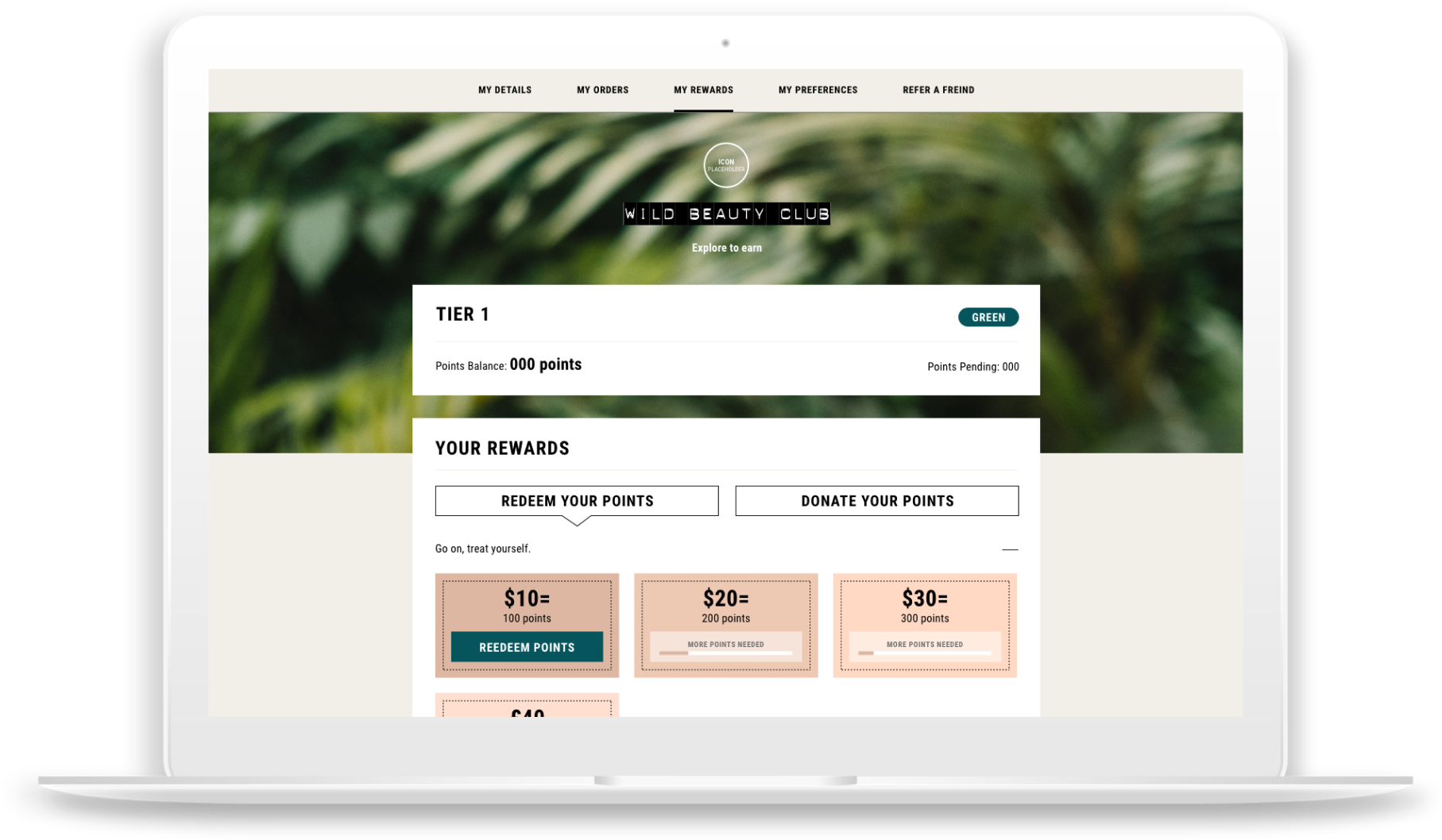
The brand was introducing a membership programme on their site, I was asked to take on the UX and UI for this huge project. I started out by identifying 3 key user journeys, membership sign up, logged out and logged in (active) members. I created userflow diagrams for these 3 journeys, this allowed me to easily identify all touch points across the site and the many possible outcomes.
View userflow diagramsI wireframed the entire journey from start to finish for every scenario, from homepage to checkout. It was a huge task, above are just a few of the wireframes of the membership page for perspective and active members. Once these were approved I moved onto creating the high fidelity designs.
This project took months to work through as there were many layers. I worked closely with the ecommerce and dev team to complete the final designs.
View all work Previous
Next